 Primary lockup
Brand resources
A stronger signal. A human response.
The GetTheCall identity turns forward movement into two simple circles.

One idea, built to travel.
From a browser tab to a campaign, the same two points carry the brand.
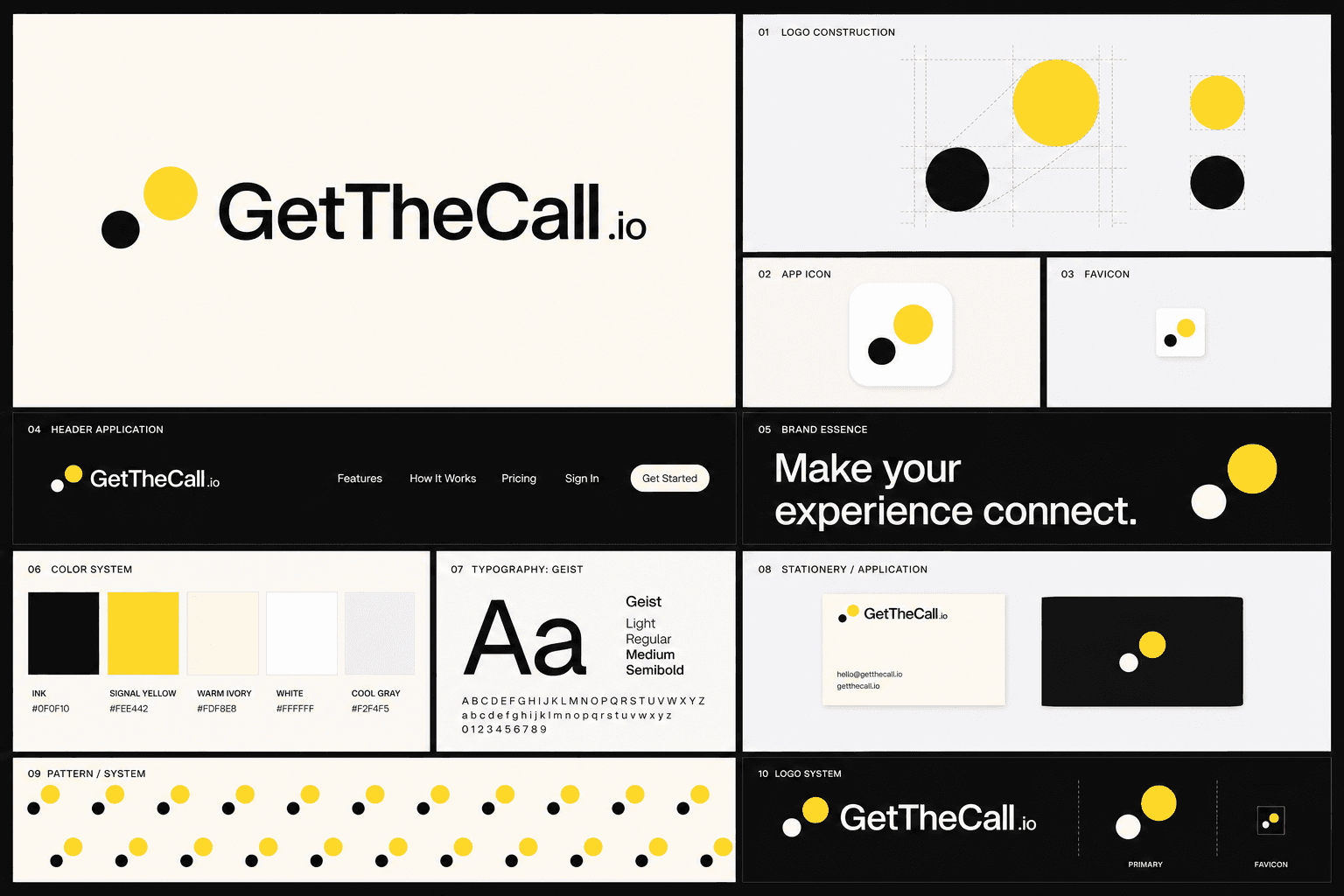
The logo system.
The smaller circle is the starting point. The larger yellow circle moves up and forward.
Primary lockupSymbol Reversed
Motion through proportion.
Two circles, one diagonal, and a deliberate change in scale create progress without relying on an arrow.
One signal color.
Yellow marks attention and progress. Everything else gives it room.
Ink
#0F0F10Signal yellow
#FEE442Warm ivory
#FDF8E8White
#FFFFFFCool gray
#F2F4F5Aa
Geist keeps the voice clear.
Direct, compact, and human. Use one family from product interface to headline.
Regular 400Medium 500Semibold 600
Keep the signal clear.
A small set of rules keeps every application recognizably GetTheCall.
Do
Keep both circles in their fixed proportion and position.
Use the ink mark on light surfaces and the reversed mark on dark surfaces.
Leave clear space equal to the smaller circle around the mark.
Do not
Do not add a phone, document, checkmark, arrow, or sparkle.
Do not recolor, outline, rotate, stretch, or add a shadow to the mark.
Do not move or resize either circle independently.
Ready when you are.
Download the complete package, or take only the production file you need.